Back to Design Portfolio
Web App · Light & Dark · Case study
Travel Dashboard
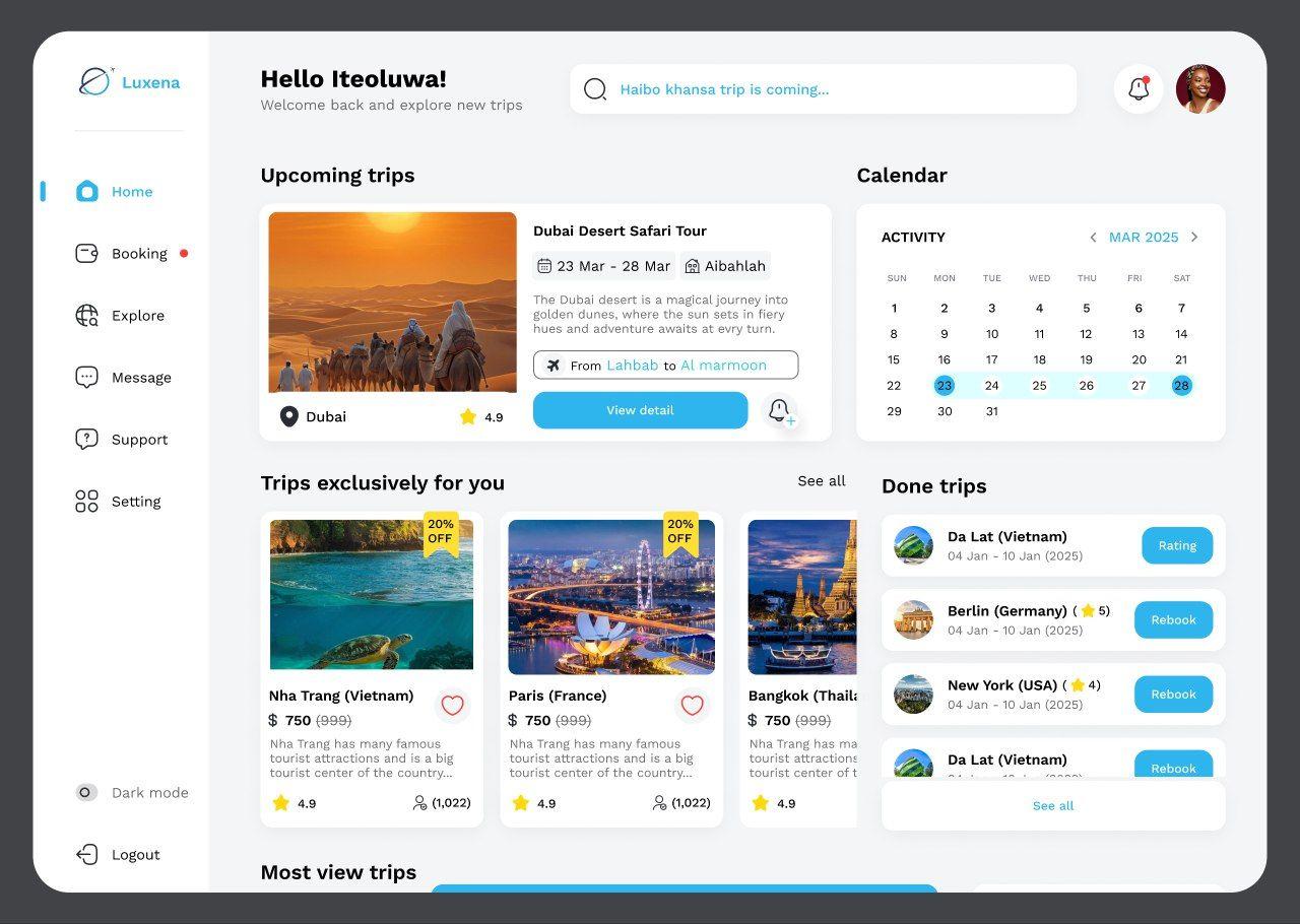
A trip-planning dashboard with calendar, destinations and a polished light and dark mode.
Project type
Web App · Light & Dark
My role
UI Designer — dashboard interface in light and dark themes.
Tools
Figma · Light & Dark Mode
The problem
Travellers juggle bookings, dates and destination ideas across many tools and need one calm place to plan.
Process
- 01
Understand
Identified the core planning tasks: upcoming trips, dates and discovering destinations.
- 02
Structure
Combined a trip overview, calendar and recommendations into one dashboard.
- 03
Design
Built matching light and dark themes from one shared set of colour and type tokens.
- 04
Refine
Checked contrast and readability in both modes.
Key decisions
- Designed both themes from a single token system so they stay consistent.
- Gave destination imagery room to inspire planning.
What I learned
Designing dark mode properly means rethinking contrast and elevation, not just inverting colours.
Like what you see? Let's design something together.
I love being part of the process that brings them to life.